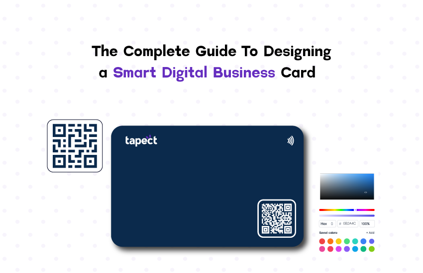
Here at Tapect, we embrace creativity and thrive on exploring the unconventional side of business cards. Tapect originated from the recognition that the conventional paper Digital business card no longer met our needs. We aimed to empower professionals to confidently portray their best selves, secure exciting opportunities, and pursue rewarding career paths without relying solely on a flawless elevator pitch or mastering the subtle art of small talk.
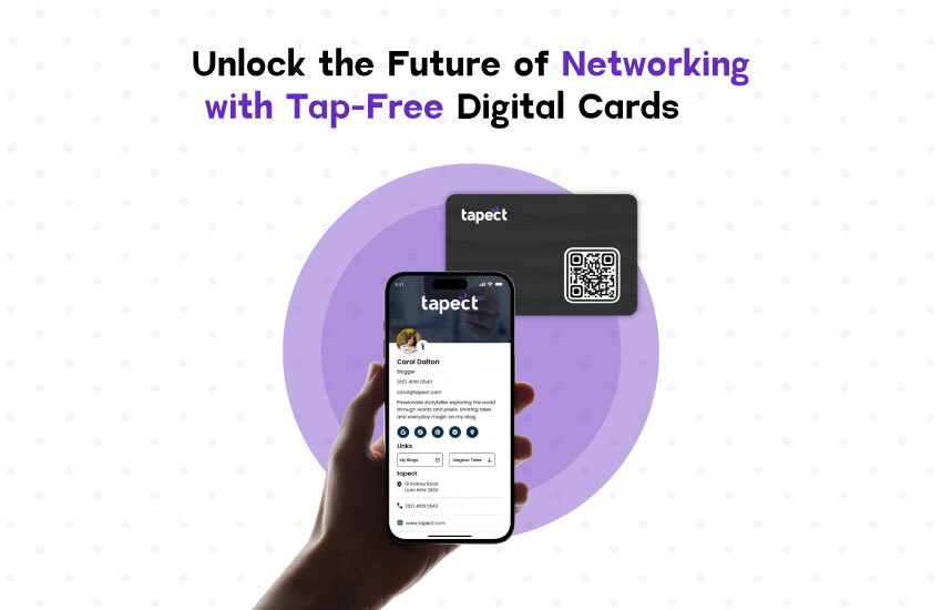
While crafting your Digital business card, you can exhibit your brand in its full splendor – from card design to social media links based on your desired aesthetic. Moreover, it’s essential to showcase your unique qualities, and what better way to achieve this than through a digital profile?
Table of Contents
1. Essential considerations before creating your card.
To start, you should input your name, contact information such as your email and phone number, and your profession. You may also consider adding your logo, but we’ll discuss that further below.
2. Choose a template that suits you.
Time to think creatively. Literally. When selecting a template, focus on crafting a unique appearance and style that distinguishes your brand. The template choice is crucial, so ponder on what appeals to you as a customer. What layout would catch your eye if you were seeking to employ someone?
3. Selecting Logos, Graphics, and Business Colors
Already with a logo or recently revamped one? Fantastic, you’re on the right track. If your current logo feels outdated or lacks impact, it’s time to showcase your Photoshop prowess or seek a professional’s assistance to elevate it.
The impact of color on the human mind is profound, especially when it comes to your brand’s colors taking center stage. In 2018, Adobe analyzed the top 100 global brands to explore color trends. Their findings showed that blue was the most dominant color, present in 33% of the leading brands. Red followed closely at 29%, while black or grayscale ranked third at 28%. Notably, Adobe noted that 95% of these brands favored one or two colors. Why? It’s a strategic decision to maintain consistency and simplicity in branding, a tactic that has proved successful.
Finally, on logos. You might have observed how some brands embrace simplicity by omitting the company name from their logos. This minimalist approach tends to resonate well with consumers, building trust and familiarity. While an intricate logo can be visually striking, it may not be easily memorable for consumers, hindering the formation of a personal connection. When in doubt, opting for simplicity is often the smartest move.
4. Maintain some whitespace.
You don’t have to fill up the entire space with words and graphics. Leave some white space – this will let your design breathe by reducing the amount of text and design elements users see simultaneously. The whole point of a Digital business card is to connect and share information – so at first glance, let your card have an element of intrigue!
5. Organize Your Information & Details
Your digital business card reflects the essence of who you are. It serves as your gateway to impressing potential employers and showcasing your capabilities. Therefore, it is crucial to carefully consider the placement of your logo/image and text before the printing process.
Typically, text is positioned in areas not occupied by the image/logo, while images and logos are placed in prominent spots such as the upper right, upper left, or the opposite side of the card. If you are employed in a creative industry or agency (where your design expertise shines), you may opt for a more innovative approach. Embrace creative freedom but strive to maintain a clean and uncluttered design aesthetic.
6. Include a catchy slogan
Writing clever copy may seem daunting, but rest assured, anyone can master it. If you’re facing a block, consider exploring renowned company slogans or engaging in a brainstorming session with peers. Occasionally, a fresh perspective can work wonders.
Here are three ingenious slogans from major brands:
Samsung: “Do what you can’t.”
This 2017 catchphrase epitomizes Samsung’s commitment to enabling customers to achieve the seemingly impossible. It conveys the brand as problem-solvers and trailblazers perfectly.
National Australian Bank (NAB) – “More than Money”
In a 2016 rebranding effort, NAB transitioned from “More give, less take” to “More than money.” Through this new tagline, the bank highlighted its heritage, trustworthiness, and the positive impact it has on the lives of Australians at every life stage.
M&Ms – “It melts in your mouth, not in your hands”
Dating back to the 1940s when M&Ms gained popularity, this iconic slogan was trademarked in 1954. While not the most famous, it cleverly emphasizes the practical, convenient, and delightful aspects of M&Ms, a treat cherished by many.
Not a seasoned wordsmith or marketing guru? No problem. Here are a few strategies to craft a remarkable slogan:
- Align your slogan with your logo. While many companies separate text from their logos, experimenting with wordplay can yield intriguing results.
- Simplicity is key!
- Opt for concise, easy-to-grasp words that flow smoothly.
- Generate a list of business-related terms (20-50 words) and visualize ideas through drawings or flowcharts.
- Incorporate compelling words or phrases. If it resonates with you, chances are it will captivate others.
- Test your slogans on various audiences – family, friends, or colleagues. Embrace constructive feedback to refine your ideas. After extensive brainstorming, stepping back and welcoming input from others can lead to breakthroughs.
7. Choose the typography
Using a 12pt font or larger for a company name is crucial, avoiding sizes under 8pt (unless targeting ants). Select a font that reflects the brand’s persona for consistency, as mismatched styles can be jarring
8. Revise, review, and evaluate your digital business card design
Once you have completed everything, save your work, review it (be cautious of typos), and then review it once more for good measure. And if any of your details change, you can easily update them!
Conclusion
Creating a digital business card with Tapect allows you to redefine your professional identity and showcase your brand in a unique and impactful way. By considering essential elements such as your contact information, logo, template, colors, whitespace, and a catchy slogan, you can craft a card that truly represents who you are. Remember, simplicity and clarity are key, and a well-organized card can leave a lasting impression. Embrace the creative process, review your design thoroughly, and confidently share your digital business card with the world. With Tapect, you’re not just creating a card; you’re building a powerful tool to open doors to new opportunities and connections.


